Setting the mood on colour
Colour is more than just a visual element in interior design; it’s a powerful tool that shapes our experiences within a space. Drawing inspiration from renowned interior designers and grounded in practical advice, this guide delves into the art and science of colour matching to help you create harmonious and personalised interiors.
The Psychology of Colour:
Setting the Mood
Colour profoundly influences our emotions and behaviours. Warm hues like reds and oranges can invigorate a space, making them ideal for social areas such as living rooms and dining rooms. Conversely, cool tones like blues and greens evoke calmness, perfect for bedrooms and bathrooms. Designer Sara Charlesworth emphasizes the importance of personal preference over trends, advising homeowners to choose colors that resonate with them and complement their home’s natural light and architecture .
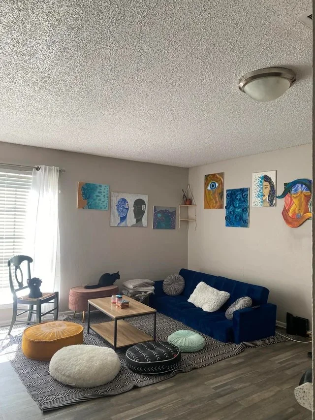
Building a Cohesive Colour Palette
1. Start with Inspiration
Begin by identifying a piece that inspires you—a rug, artwork, or fabric. This item can serve as a foundation for your color scheme. Designer Sasha Bikoff suggests using such elements to develop cohesive and expressive color palettes .
2. Limit Your Palette
Working with 3 to 5 colours keeps a room interesting yet coherent. Too few colors can feel monotonous, while too many may overwhelm the space .
3. Consider Undertones
Ensure that the colours you choose share similar undertones. This subtle alignment creates a harmonious look, even when combining different colors .
Techniques from the Experts
Layering with Neutrals
Alvin Wayne recommends balancing vibrant colors with neutrals to create inviting environments. He often uses strong shades like navy blue as grounding neutrals and incorporates black and white for contrast, providing visual rest within a space .
Embracing Bold Choices
Avery Cox advocates for enveloping a room in color by painting walls, ceilings, and trim in the same hue. This technique creates an immersive experience and demonstrates that strong color use doesn’t equate to chaos when executed thoughtfully .
Personalising with Earthy Tones
Cortney Bishop encourages the use of warm, earthy tones like greens, terra cotta, and deep reds, tailored to the local environment. She suggests starting with personal inspiration to build a cohesive color palette and recommends adding color to cabinetry, doors, and architectural details for a personalized, timeless look .
Practical Tips for Colour Matching
Test Before You Commit: Always test paint colors in your space under different lighting conditions. Colors can look dramatically different depending on the time of day and the room’s orientation.
Use the 60-30-10 Rule: Distribute colors in a room by using 60% of a dominant color, 30% of a secondary color, and 10% of an accent color. This ratio creates a balanced and visually appealing space .
Incorporate Texture: When working with neutral palettes, layering different textures can add depth and interest to a room. Materials like velvet, linen, and wood can bring a neutral color scheme to life .
Navigating Trends and Personal Style
While it’s tempting to follow the latest colour trends, it’s essential to choose colors that reflect your personality and the atmosphere you wish to create. Designer India Mahdavi advises against limiting yourself to only one or two colors, encouraging experimentation to find harmony in diversity .
Final Thoughts
Colour matching in interior design is a blend of art and science. By understanding the psychological impact of colors, building a cohesive palette, and applying expert techniques, you can create spaces that are both aesthetically pleasing and personally meaningful. Remember, the best designs are those that resonate with you and enhance your daily living experience.
Below you can find great reference points to help you choose the pallet that suits you
Top Colour Palette Tools for Interior Design
1. Adobe Colour Wheel
Adobe’s Color Wheel allows you to create custom color palettes based on color theory principles. You can explore existing themes or generate new ones using various harmony rules. For instance, the “Bee” color theme offers a palette inspired by natural hues.
2. Coolors
Coolors is a fast and user-friendly color scheme generator. It enables you to create, save, and export palettes, and even extract colors from images, which is particularly useful for interior design projects.
3. Loading.io Color Palette Collection
Loading.io offers a vast collection of customizable color palettes available in various formats like PNG, SVG, and JSON. Their “Bee” feature showcases palettes inspired by bee-related themes, providing inspiration for nature-infused designs.
4. Paletton
Paletton is an interactive color scheme designer that helps you create palettes based on a selected base color. It’s particularly useful for understanding color relationships and ensuring cohesive designs.
5. Colorwise.me
Colorwise.me offers a personalized approach by analyzing your features to suggest suitable color palettes. While primarily used for fashion, its principles can be applied to interior spaces to reflect personal aesthetics.
These tools can aid in selecting colour palettes that resonate with your design vision, ensuring a cohesive and appealing interior space.
For more insights and design inspiration, visit our blog at Altura Studios.